
-
Table of Contents
Your website’s layout isn’t just about aesthetics—it directly influences how visitors navigate, engage with content, and make decisions. A thoughtfully designed layout goes beyond looks; it builds your brand, improves user experience, and, importantly, helps grow your business.
But with so many design options available, how do you choose the best website layout for your site? As part of your website planning process, selecting the right layout can make a huge difference in user experience and conversions.
In this article, we’ll break down the most effective website layouts, explain examples and why they work, and help you pick the right one so that your website not only looks amazing, but works at its absolute best.
But first, let’s make sure we’re all on the same page.
What is a Website Layout?
A website layout is the arrangement of visual elements on a webpage, including text, images, buttons, and navigation menus. As part of your website checklist, choosing the right layout plays a super important role in user experience, engagement, and conversion rates.

A good layout balances both design and functionality, lending to an intuitive user experience that guides your visitors through your site (and hopefully to conversions!).
Why Does Website Layout Matter?
Of course you want a good website layout, and we know it should look nice and work properly. But how does it really impact the bigger picture? Your website layout impacts:
- User Experience (UX): Beyond basic functionality, a clear, simple, and structured layout makes navigation seamless and improves usability—that way, users don’t have to think about how to interact with your site; it just happens naturally.
- Engagement: Strategic placement of elements—like, calls to action, for example—keeps visitors interested and encourages interaction.
Conversions: A well-designed layout guides users toward those aforementioned calls to action, increasing sign-ups, sales, or other desired actions. Tracking digital marketing metrics—such as bounce rate, time on page, and conversion rates—helps you determine whether your website layout is really getting the job done.

13 Best Website Layout Ideas
Now that you’re convinced of just how very important it is to put extra thought into your site layouts, let’s examine 13 of the best website layout ideas, along with examples, that can help you create an engaging and high-converting site.
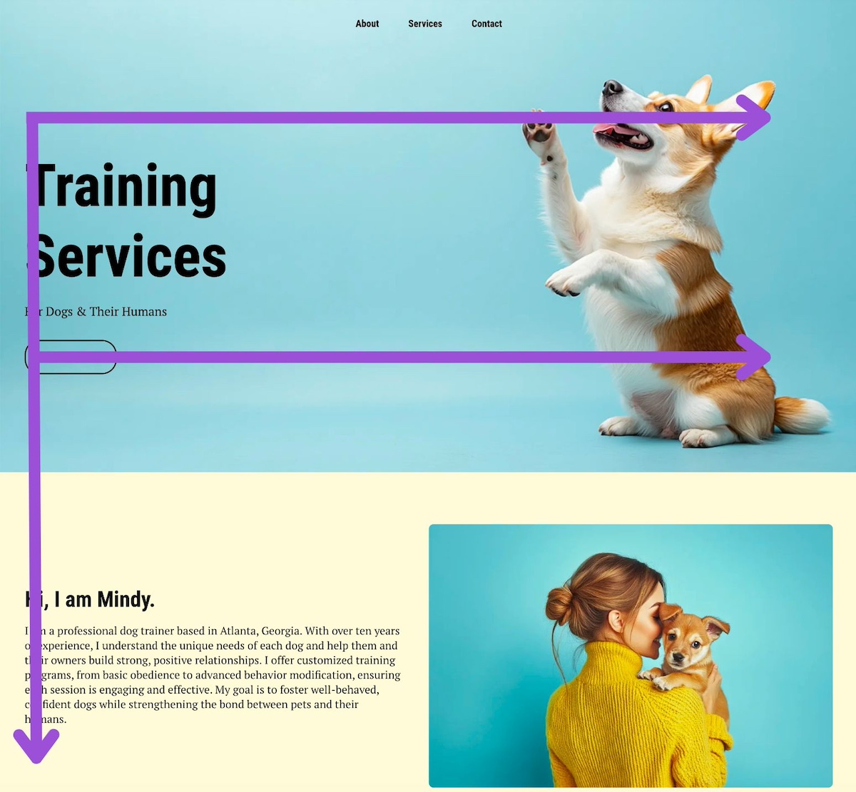
1. Hero Layout
The hero layout is one of the most common and widely used website layouts because it’s typically used for homepage design. It usually features a large, visually striking section at the top of the page, including a high-quality image that really sets the vibe for your services and offerings. Overlaying this visual is usually a compelling headline, a subtitle, and a clear call to action (CTA).
This layout is often the first thing visitors see, making it your best chance for grabbing attention and setting the tone for user experience with the rest of the site.

Why the Hero Layout Works
- Captures Immediate Attention: A well-designed hero section instantly captures visitors’ attention so that they stay on the page rather than bouncing.
- Establishes Brand Identity: The hero area is often where businesses communicate their core message, value proposition, and/or brand personality through visuals and copy.
- Guides Users to Take Action: The CTA importantly directs users toward the next step in their journey, whether that means signing up, exploring products, or learning more.
- Improves User Experience: By placing key information front and center, the hero layout makes navigation easier and helps users understand the purpose of the website quickly.
Because of its versatility and effectiveness, the hero layout often serves as the foundation for many of the other layouts we’ll be discussing today. For example, variations like the fullscreen image layout, split-screen layout, and even asymmetrical designs frequently incorporate hero sections at the top of the page.
Pro-tip: the hero section layout is also a go-to layout for landing pages given its ability to get the message across and drive conversions.
2. Asymmetrical Layout
Speaking of an asymmetrical layout, this idea breaks away from traditional grid-based designs, using uneven spacing, contrasting element sizes, and unique alignments to create a more artsy and modern look. Instead of mirroring elements evenly on both sides, this website layout embraces imbalance to guide the user’s eye strategically across, and even down the page.

Why the Asymmetrical Layout Works
- Creates a Bold, Modern Aesthetic – If a brand wants to stand out from competitors, an asymmetrical design can give a fresh, cutting-edge feel that signals creativity and innovation.
- Enhances Visual Interest & Storytelling – The unconventional structure draws attention to specific elements, allowing brands to emphasize certain messages, products, or calls to action, and imagery in a unique way.
- Encourages Engagement – By breaking predictable patterns, asymmetry keeps users intrigued and exploring the page more actively.
- Works Well with Minimalist Design – Even in a minimalist website, an asymmetrical layout can introduce contrast and movement while maintaining simplicity.
When to Use the Asymmetrical Layout
While asymmetrical layouts can be highly effective, they require a good design eye to make sure they remain user-friendly, attractive, and don’t feel chaotic. Not surprisingly, designers, artists, and brands with a strong visual identity often favor asymmetrical layouts to showcase their work in a way that feels dynamic and immersive. When done right, it looks pretty and works well!
3. Z-Pattern Layout
The Z-pattern layout idea follows the natural way users scan a webpage, moving their eyes in a zigzag motion from left to right and then diagonally down the page. Scaling a business often requires clear messaging; the Z-pattern layout helps transmit this by making sure visitors follow a natural path to the most important parts of your site.

Why the Z-Pattern Layout Works
- Aligns with Natural Eye Movement – Most people scan web pages in an F or Z shape, making this layout intuitive and easy to navigate.
- Balances Visual & Text Elements – The alternating sections allow for a mix of images and text, making content more digestible and engaging.
- Directs Attention to CTAs – By strategically placing headlines, visuals, and calls to action along the Z-path, businesses can guide visitors toward conversions more effectively.
- Great for Storytelling – The natural flow of this layout makes it ideal for brands that want to lead visitors through a narrative, gradually building interest and leading to a final action.
When to Use the Z-Pattern Layout
Businesses that rely on a mix of visuals and text to convey their message—such as landing pages, service-based websites, and marketing campaigns—often benefit from this layout. It keeps users engaged while subtly directing them toward the most important sections of the page, like a sign-up form or product showcase.
4. F-Pattern Layout
The F-pattern layout is based on how users typically scan text-heavy web pages layouts—starting at the top left, moving horizontally, then scanning down the left side, and occasionally making shorter horizontal movements across the page. This scanning behavior resembles the shape of the letter “F,” making it an optimal layout idea for content-rich websites.
Why the F-Pattern Layout Works
- Matches Natural Reading Behavior – Since people tend to read from left to right, the F-pattern aligns with how visitors instinctively process information.
- Ideal for Content-Heavy Pages – News websites, blogs, and resource hubs often use this layout to present large amounts of text in a way that remains scannable.
- Prioritizes Key Information – The most important content (headlines, subheadings, and CTAs) is positioned where users’ eyes are most likely to land.
- Improves Readability & Usability – The structuring content in an F-pattern helps reduce cognitive load and make it easier for visitors to find relevant information.
When to Use the F-Pattern Layout
Indeed, the F-pattern layout is best suited for text-heavy pages like blogs, news sites, product listings, and search results, where users primarily scan rather than read in depth. This website layout idea helps highlight key content while keeping information simple and easy to digest. And for small business marketing, this layout makes sure visitors follow a natural—but intentional path—to the most important parts of your site, helping to achieve those much-desired conversions.
5. Fullscreen Image Layout
The fullscreen image layout features a large, high-quality image that spans the entire background of a webpage, often with minimal text and a strong CTA. This visually immersive design is commonly used to create a striking first impression and evoke emotion.

Why the Fullscreen Image Layout Works
- Captures Immediate Attention – A bold, fullscreen image instantly draws visitors in, making it a great website layout idea for high-impact storytelling.
- Creates an Emotional Connection – Evocative visuals can convey a brand’s personality, mood, or message more effectively than text alone.
- Encourages Focused Interaction – With minimal distractions, visitors are naturally guided toward messaging and CTAs.
- Enhances Mobile Experience – A fullscreen design adapts well to different screen sizes, making it easier to offer a seamless browsing experience across devices.
When to Use the Fullscreen Image Layout
This layout idea is perfect for brands that rely on strong visuals, such as photographers, travel agencies, fashion brands, luxury products, and landing pages promoting a single product or campaign. It works best when the image is carefully chosen to align with the brand message.
6. Split Screen Layout
The split screen layout divides the page into two equal or asymmetrical sections, each featuring different content. This design allows two elements to have equal emphasis, also with the possibility for users to quickly compare two options without excessive scrolling.

Why the Split Screen Layout Works
- Creates a Balanced Visual Hierarchy – By giving equal weight to two key elements, this layout ensures both get attention without overwhelming the visitor.
- Works Well with Minimalist Design – A split screen keeps the layout clean while still allowing for diverse content presentation.
- Enhances User Engagement – Visitors are more likely to interact with the page since it invites them to explore both sections, encouraging exploration without feeling overwhelming or cluttered.
- Offers Clear Choices – Suited for businesses with multiple offerings, such as different services, product categories, or user paths (such as, “Shop Men” vs. “Shop Women”).
When to Use the Split Screen Layout
This simple website layout is great for businesses that need to present two distinct options, such as ecommerce stores, service providers with multiple offerings, or landing pages that cater to different user types. It’s also effective for showcasing strong visuals alongside supporting text.
7. Features & Benefits Layout
The features and benefits layout is designed to highlight key product or service features while clearly explaining the benefits to the user. This layout ensures that visitors not only understand what is being offered but also why it matters to them.

Why the Features & Benefits Layout Works
- Clarifies Value Proposition – Helps visitors quickly grasp how a product or service solves their problems.
- Balances Information & Visuals – Typically uses icons, images, or illustrations alongside concise text to keep content engaging.
- Improves Readability & Flow – Features are presented in digestible sections, often with an alternating or grid structure.
- Encourages Conversions – Often includes CTAs after key benefits, prompting users to take action.
When to Use the Features & Benefits Layout
This layout is ideal for product pages, SaaS websites, landing pages, and service-based businesses where communicating value succinctly is nonnegotiable. It helps visitors quickly understand why they should choose your offering over competitors.
8. Grid Layout
The grid layout arranges content into a structured, evenly spaced grid, making it easy to scan and visually appealing. It provides a clean, organized look while maintaining flexibility in how elements—such as images, text, and buttons—are displayed.

Why the Grid Layout Works
- Creates a Sense of Order & Balance – The structured design helps present multiple pieces of content without overwhelming the user.
- Enhances Readability & Navigation – By neatly organizing content into sections, visitors can quickly find what interests them.
- Highly Adaptable & Responsive – Works well for different screen sizes, ensuring a seamless experience on desktops and mobile devices.
- Optimal for Visual & Product-Based Sites – Perfect for showcasing images, such as in portfolios, ecommerce stores, or galleries.
When to Use the Grid Layout
This layout is commonly used for portfolio websites, ecommerce stores, blogs, and galleries where multiple items need to be displayed at once. It’s especially effective for brands that rely on strong visuals to engage their audience.
9. Card Layout
The card layout presents content in self-contained, rectangular blocks (or “cards”), each typically featuring an image, a headline, a short description, and a call to action. This modular design makes it easy to organize and display various types of content in a digestible way.

Why the Card Layout Works
- Highly Scannable & Organized – Users can quickly browse through multiple pieces of content without feeling overwhelmed.
- Flexible & Adaptable – Works well across different screen sizes and can be arranged in grids, rows, or columns for a dynamic experience.
- Encourages Interaction – Cards often include clickable elements, making them ideal for engaging users with blog posts, products, or portfolio items.
- Popular Across Many Industries – Frequently used by e-commerce sites, news platforms, and social media (e.g., Pinterest, Instagram, and Trello).
When to Use the Card Layout
This website layout idea is great for ecommerce stores, blogs, portfolios, dashboards, and content-rich websites that need to display multiple items in a user-friendly way. It’s especially useful for sites with dynamic or frequently updated content.
10. Gallery Layout
The gallery layout arranges visual content—typically images—in a structured format, often using a grid, masonry, or carousel design. This layout prioritizes aesthetics and engagement, making it a good choice for visually driven websites.

Why the Gallery Layout Works
- Showcases Visual Content Effectively – Great for photographers, artists, designers, and ecommerce brands that rely on strong visuals.
- Creates a Clean, Organized Look – Keeps images aligned and structured, making it easy for users to browse content.
- Enhances User Engagement – Interactive elements like hover effects, lightboxes, and sliders make the experience more dynamic.
- Optimized for Mobile & Desktop – Gallery layouts can adapt to different screen sizes while maintaining visual appeal.
When to Use the Gallery Layout
This layout is perfect for photography portfolios, art websites, fashion brands, travel blogs, and ecommerce stores that want to display products or creative work in a visually compelling way.
11. Box Layout
The box layout refers to a design style where content is contained within boxes or distinct sections that are clearly separated from each other, often with borders, padding, or background color contrasts. This layout helps to organize information and guide the user’s eye through the page.

Why the Box Layout Works
- Provides a Clean, Balanced Structure – Content remains neatly contained, making it easy to read and navigate.
- Enhances Focus on Core Content – The boxed format naturally draws attention to the main elements, reducing distractions.
- Works Well with Minimalist & Traditional Designs – Often used in corporate, business, and blog websites for a polished, professional look.
- Offers a Strong Sense of Hierarchy – Helps segment content into clearly defined sections, improving readability.
When to Use the Box Layout
The box layout works well for presenting content that needs clear separation, such as product listings, blog posts, or individual services. It’s a simple website layout that can also be used for things like portfolios or case studies, where each project or example is highlighted within its own section.
12. Horizontal Strips Layout
The horizontal strips layout divides a webpage into full-width sections (or “strips”) stacked vertically. Each strip typically highlights a different type of content, such as an introduction, features, testimonials, or a call to action, creating a scroll-friendly and sequential user experience.

Why the Horizontal Strips Layout Works
- Improves Readability & Flow – By breaking content into clearly defined sections, users can easily follow the page without feeling overwhelmed.
- Works Well for Storytelling – Each strip can present a different aspect of a brand, product, or service in a logical sequence.
- Enhances Visual Hierarchy – Alternating background colors, images, or typography help guide the user’s attention.
Mobile-Friendly & Responsive – Adapts well to different screen sizes, making it a great choice for modern web design.
When to Use the Horizontal Strips Layout
This layout is great for landing pages, business websites, product showcases, and long-scroll designs where structured storytelling is important. It works particularly well for conversion-driven pages (like landing pages) that guide users through a step-by-step experience.
13. Alternating Layout
The alternating layout arranges content in a staggered pattern, typically switching between text on one side and an image or video on the other. This creates a visually dynamic experience that keeps users interested as they scroll.

Why the Alternating Layout Works
- Enhances Engagement & Readability – Breaking up content into alternating sections prevents monotony and keeps visitors interested.
- Creates a Natural Flow – Mimics how people scan content, leading them smoothly from one section to the next.
- Great for Storytelling – Works well for explaining processes, showcasing features, or guiding users through key information.
- Balances Text & Visuals – Ensures neither text nor images overwhelm the design, keeping a harmonious structure.
When to Use the Alternating Layout
This layout example is best for business websites, product pages, about pages, and service explanations where a mix of visuals and text helps convey information effectively. It’s especially useful for brands that want to create a compelling, easy-to-follow narrative.
Website Layout Best Practices
It’s one thing to pick a layout that works for you, and it’s another to implement it the most effective way possible. So now that you know the different layout options, here are some key best practices to keep in mind:
1. Consider Your Offering, Audience, and Goals
Your layout should reflect what you’re offering, who your target audience is, and what actions you want users to take. For example, an ecommerce site may prioritize a grid or card layout for product browsing, while a service-based business may use a hero layout to highlight key offerings. Also keep in mind the customer journey, and which touchpoints you want to hit, where and how.
Bottom line: don’t pick a layout just because you like it; pick it because it’s best suited to meet your business’s goals.
2. Keep It Simple
Overly complex layouts or unnecessarily over-the-top designs can overwhelm visitors. Sure, they’re nice to look at, but not always so nice to interact with. Stick with a clean, predictable design with clear navigation so that it’s easy for users to find information and take action. Avoid clutter, excessive text, and too many competing elements.
And while it can be novel to have a site with lots of flashy design elements (like animations or sideways scrolling), these fancy bells and whistles create user confusion and possibly even a slow and poorly functioning site. Stick to what works.
3. Base It on Content
Your content should dictate your layout—not the other way around. For example, if your site is highly visual, a gallery or fullscreen image layout may be best. If it’s text-heavy, an F-pattern or or Z-pattern will improve readability.
Identifying the key messages you wish to get across can help you identify which layout, or layouts, might best tell your story.
4. Use Different but Complementary Layouts
Not every page on your website calls for the same layout. A homepage might use a hero layout, while a blog page might follow an F-pattern for readability. The key is maintaining a cohesive design that feels unified across the site. So go ahead and mix up your layouts based on your content needs—just make sure that the brand experience and design feels consistent and not chaotic.
5. Be Mindful of Loading Speed
Layouts with large images, animations, or complex scripts can slow down your site, leading to higher bounce rates and lower conversions. So as you build your site, be sure to optimize images, minimize unnecessary elements, and use a lightweight, efficient design to improve load times.
If you’re using WordPress you can get this done easily by using the SiteGround Speed Optimizer plugin, which automatically addresses many speed-inhibiting elements of your site. Or, you can build your site with the SiteGround Website Builder straight away, and benefit from built-in speed, security, and SEO, as well as a super easy-to-use interface along with beautiful templates.

6. Ensure Compatibility on Different Devices
Just because your website looks amazing on a desktop computer doesn’t mean it’ll look as good on other screens. And yet it’s essential that your layout be responsive and adapt seamlessly to different screen sizes, so make sure to design your site for all screens, and test it to make sure it gets the job done.

Ready to Bring Your Website Layout to Life?
Your website’s layout is more than just a boring digital business brochure—it’s the foundation for how visitors interact, engage, and ultimately convert. Perhaps you’re drawn to the clean structure of a grid layout, or the storytelling flow of a Z-pattern, or maybe the bold impact of a fullscreen hero section—whichever you prefer, the right design can make all the difference.
Keen to put one or several of these layouts—or even designs—into action? All of these templates are available to you via the SiteGround Website Builder. Not only is it mega easy to use, but it makes site creation hassle-free, fun, and attractive. Plus, you’ll have peace of mind knowing that your site works flawlessly (on all devices), and can grow alongside you and your business.
No matter which layout you choose, one thing’s for sure: A well-structured website doesn’t just look good—it keeps your visitors interested and those conversions rolling in.


Comments ( 0 )
Thanks! Your comment will be held for moderation and will be shortly published, if it is related to this blog article. Comments for support inquiries or issues will not be published, if you have such please report it through our official channels of communication.
Leave a comment
Thanks! Your comment will be held for moderation and will be shortly published, if it is related to this blog article. Comments for support inquiries or issues will not be published, if you have such please report it through our official channels of communication.